Jan Pauwels’ Universe series for Quasar may be the most important decorative lighting collection of the 21st century so far. It is certainly one of the most versatile and best value.
This post sets out to explain what it can do, with lots of classified examples. It should not only help you to work out if Universe could be relevant to your project, but also give you lots of images to plunder when you are putting together a case for one to your client.
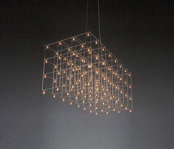
Its components couldn’t be simpler: wire and tiny lamps:
The wire comes in four finishes: nickel, brass, copper and black brass. There are two types of lamp, both LEDs. One is a tiny E10 bulb...
...and the other is a silicon chip with LEDs on it. (Note that if chips are used, a Universe is called a Cosmos. I'll use Universe here.).
The chip has two LEDs pointing downwards, to cast plenty of light on a table underneath, and one pointing upwards to add to the ambient light:
The lamps reflect off the structure, multiplying the starlike effect.
STANDARD, CATALOGUE DESIGNS
Quasar make Universe in many standard forms.
Rectilinear
Universe Square
Orion:
Random
Circular
Spectre
Cosmos Globe
Note that almost all the standard Universe designs come in several sizes. Thus, Cosmos Globe can be Ø60cm, Ø80cm, Ø100cm or Ø120cm.
Chandelier-shaped
Some have real crystal drops. Meet again Mira, that stopped visitors in their tracks in the 2018 edition of Sleep:
Inspired by nature
Like this leaf-shaped Philae:
And the rain-inspired Universe Square with Drops:
This is the amazing snakey Cobra:
Amorphous
As in Curled:
And Universe Disc:
Those brighter lights are spotlights.
They are an optional extra when more light is required below the piece, though with the power of LEDS nowadays, they are rarely necessary.
The wires are usually straight, but not always. See The Mira chandelier above, and this Curled:
Glass rods
The addition of glass rods has a remarkable effect:
The compositions seem gently to merge with the air around them:
The standard designs can be modified and completely new, site-specific designs can be made. This is because (relatively unusually for fine lighting companies), Quasar make them themselves, in an enchanting corner of the Netherlands (so charming, it is where they film the Dutch version of Doc Martin).
Thus Universe suits many very different spaces! For example...
SPACES
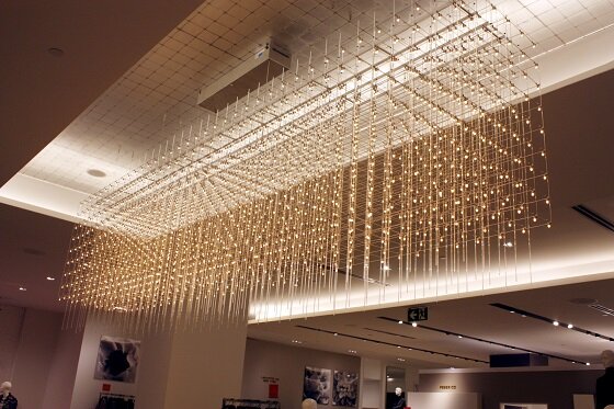
Large spaces
Seriously large spaces
Small, domestic spaces (and restaurants)
Particularly over dining tables:
Luxury spaces
This installation, in the Wonder Room in the Oxford Street Selfridges, is the best freely-accessible reference site in UK, so if a client wants to see a Universe for real, send them here.
It does its job well. Not only does it look fantastic in the concession, it also draws the eye from across the room. It’s a good example of why I say that the cost of a spectacular feature light should come out of the marketing budget!
These we saw on the telly when a series about Monaco ("Playground of the Rich") was being shown. They are in the Hôtel de Paris, where suites can cost €40,000 a night…. This is also a good illustration of how impressive Universe chandeliers can be when they are small:
Hospitality
Besides guest rooms, as we’ve just seen, Quasar’s Universe works in function rooms:
In a Marriott Hong Kong:
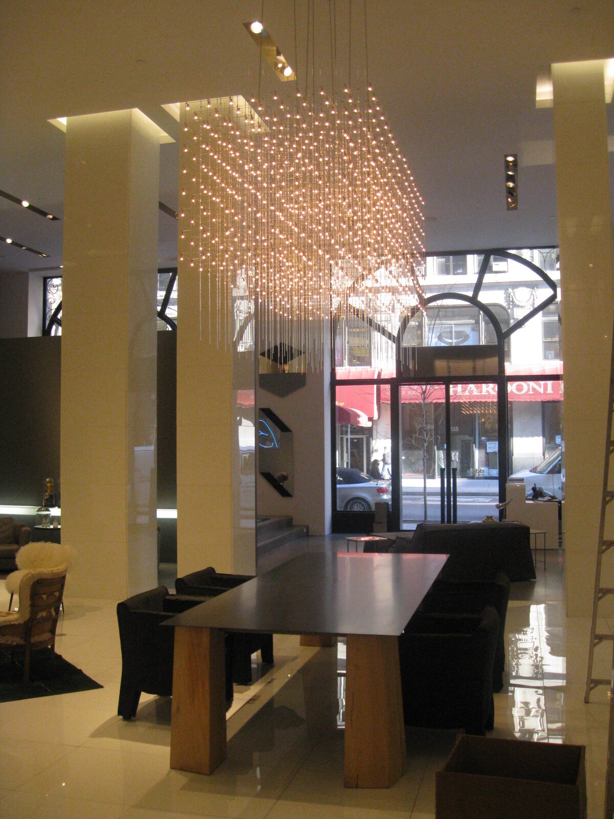
And particularly well in main entrances...
...as well as foyers, small...
…and larger:
See below how well a slim, single layer version of Universe dresses this reception desk, where the ceiling is so low that there isn't room for anything deeper. On the other hand, it had to be long, so by giving it ripples, it has movement—it is not static:
Retail
At Saks 5th Avenue:
Awkward spaces
Quasar’s Universe is very dramatic and unexpected going down stairwells:
Even down through very narrow spaces:
And, look at this! Quite narrow at the top and then broadening out (asymmetrically!) as the space it drops into broadens out. I can’t think of another design that does this—that could do this!
Here is a substantial void over a staircase. What on earth could you do with it? Well, Quasar’s Universe provides a solution: three staggered sections:
And supposing you have a staircase with a window above it, so that the wow factor chandelier you install wows the neighbours as well! Plus there is the added bonus of reflexions in the window glass:
LIGHT AND AIRY
From a specifier’s point of view, it is not enough that a feature installation thrills everyone who sees it, or even that it is within budget. There are always practical issues to deal with as well. Universe is physically lightweight, so it can go where most alternatives would be too heavy. It is also virtually see-through, so it does not obscure a view beyond it (this is the Hôtel de Paris again)…
…or even a painting behind it:
It means you can install something very large where the space requires it, but people don’t feel that they’ve got the sword of Damocles hanging over their heads—it looks as lightweight as it is:
AND FINALLY…IT CAN BREATHE!
Yes! You can see Jan Pauwels’ Breathing Chandelier in Ghent’s very fine design museum. Originally part of a temporary exhibition, it was so popular that it is now part of the permanent collection.
It contrasts with this interior in the old part of the museum…
The composition is in two parts. The box at the top moves them both very gently, to give the breathing effect. Genuinely magical!
So I hope that my claim that Jan Pauwels’ creation may be the most important decorative lighting concept of the 21st century so far no longer seems far-fetched.
Do get in touch to discuss how Universe could be right for your project. There’s a lot more to say and more images! Click here for Quasar's web site.
Note, however, that Universe is so effective, so versatile, and so well-priced, production between now and Christmas is nearly fully booked, so don't hang about!


